Choosing the right background fabric is an important step in creating a visually appealing and harmonious quilt. The background fabric sets the tone for the quilt, influencing how the other fabrics and colors will interact. In today’s blog, we’ll explore the art of selecting background fabrics, with a focus on contrasting colors.
Solids
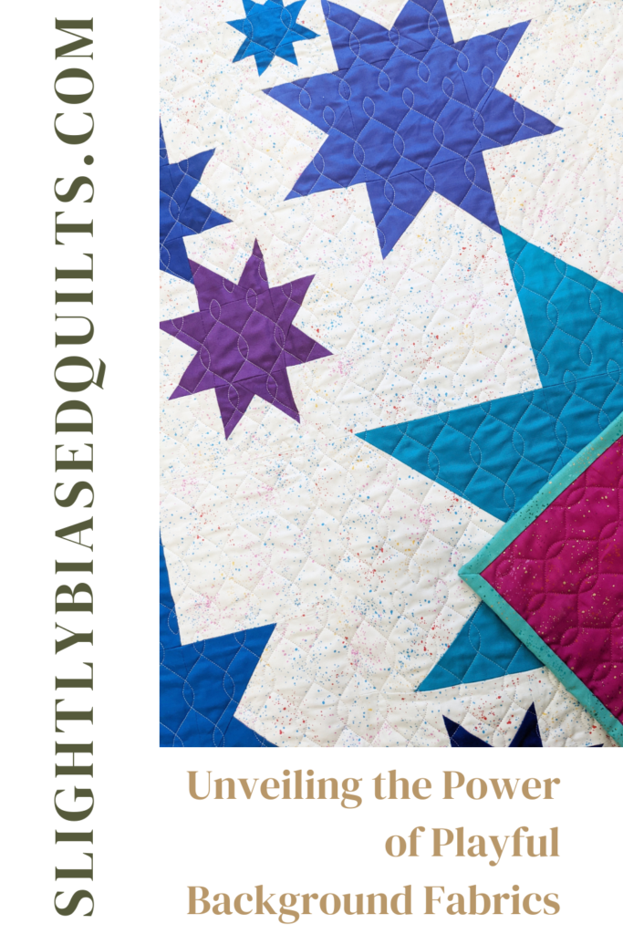
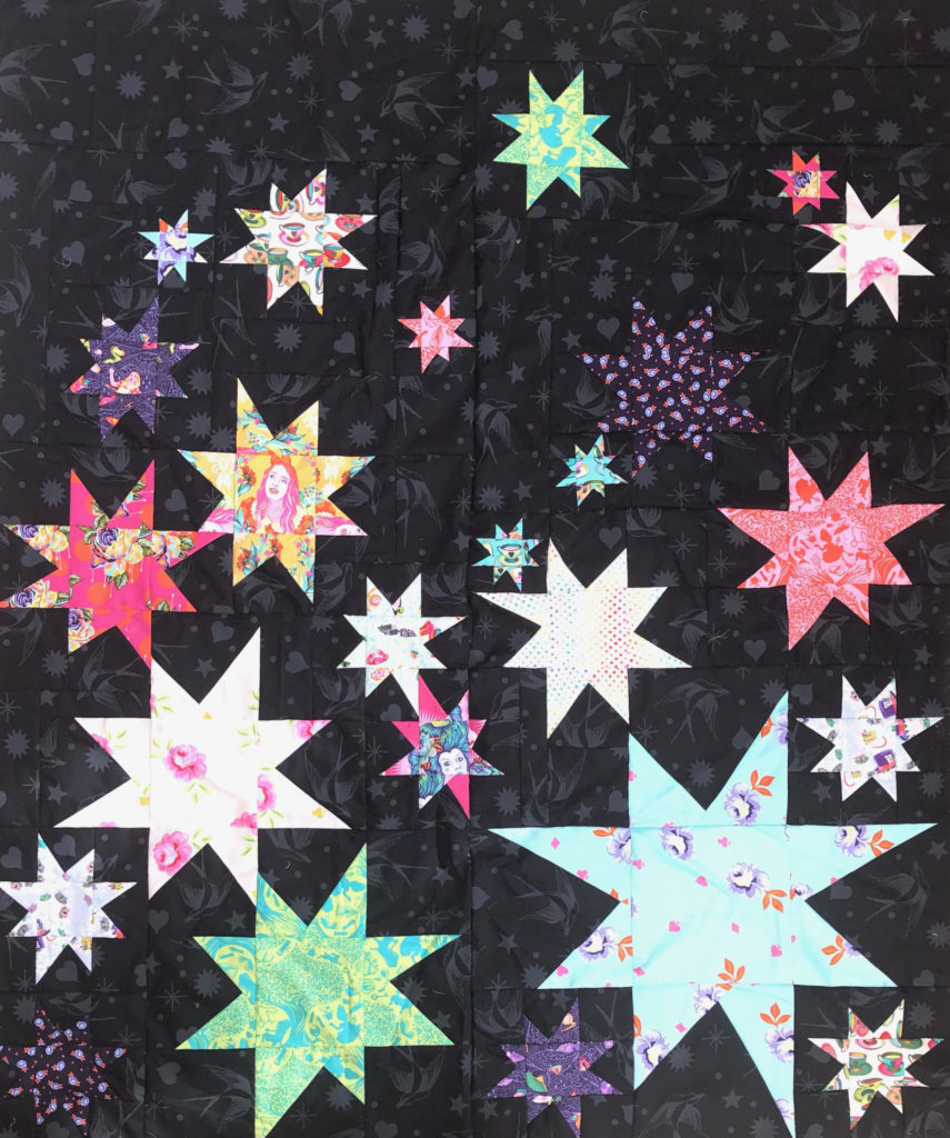
Solid fabrics are a timeless choice for background material. They provide a clean, classic look, allowing other colors and patterns to take center stage. When choosing a solid background, consider the overall color scheme of your quilt. Opt for neutrals like white, cream, or gray for a versatile backdrop that complements a wide range of colors. Dark colors like black, deep purple, navy blue can also have an interesting effect depending on the color scheme of your blocks. These darker hues work really well with brights.
Low Volume
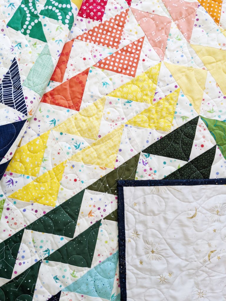
Low volume fabrics add subtle texture and interest to your quilt without overwhelming the design. These fabrics typically feature delicate prints or neutral tones. Consider using low volume fabrics as background material when you want to add depth without distracting from the main focal points of your quilt. Low volume fabrics can also include things like brushed or confetti prints. These have a more modern look to them, while ditsy florals, tiny geometrics, or tone-on-tone prints bring a softer, more traditional look to your quilt. Shop my recommended background fabrics here.
Contrasting Colors, Harmony and Cohesion
For a bold and dynamic look, consider using a contrasting color as your background. This approach adds energy and vibrancy to your quilt and can really make your piecing pop! Placing a Ruby Red ruler over your fabrics can help identify if your fabrics have enough contrast.
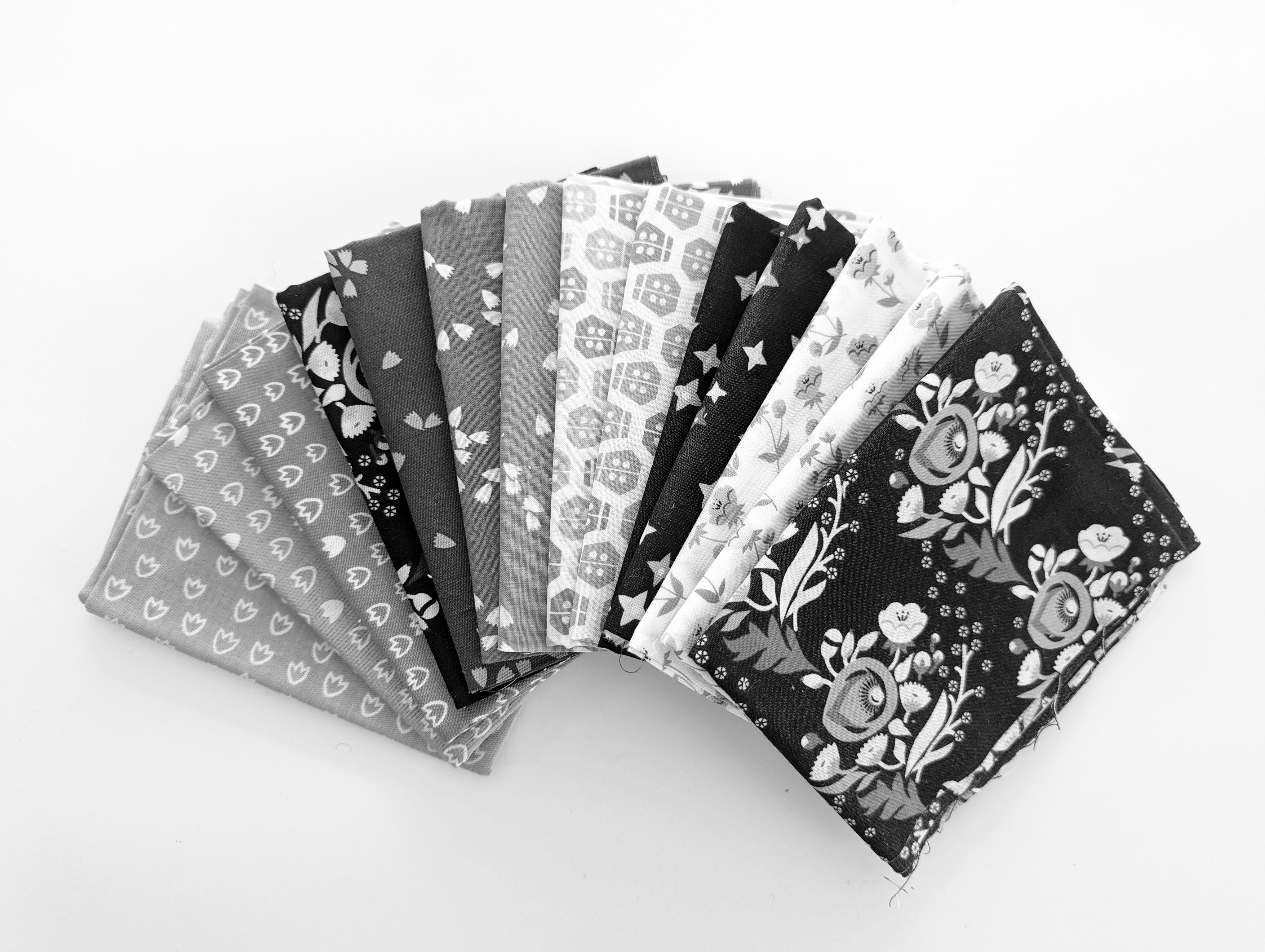
Another way to see if you have a good amount of contrast is to take a picture with a smartphone and use a black & white filter. Regardless of whether you choose solids or low volume fabrics, always aim for harmony and cohesion in your quilt. Ensure that the background fabric complements the overall theme and style of your quilt. I like to think about the mood I want to convey – whether it’s calming and serene, vibrant and energetic, or sophisticated and timeless. Taking a moment to make an inspiration page and then referring to it as you select fabrics is also a great way to keep things cohesive.
Personalization and Creativity
Remember that quilt-making is a creative and personal endeavor. Don’t be afraid to trust your instincts and inject your personality into your quilts. Consider your own preferences, the recipient’s taste (if it’s a gift), and the intended use of the quilt. Whether you opt for a solid, low volume, or something completely unique, let your creativity shine through.
Selecting the perfect background fabric is a crucial step in the quilt-making process. Different fabric choices offer unique opportunities for creative expression. By considering the overall design, color scheme, and personal preferences, you can create a quilt that not only showcases your skills, but also tells a story through carefully chosen background fabrics. Happy quilting!