There’s a little magic in quilting that often gets overlooked: the background fabric. We spend so much time choosing striking prints, coordinating colors, and arranging blocks just so—but the background is what lets those elements shine. And come spring, when colors feel lighter, fresher, and brighter, a well-chosen background can completely transform a quilt from pretty to pop!
Why Background Fabrics Matter
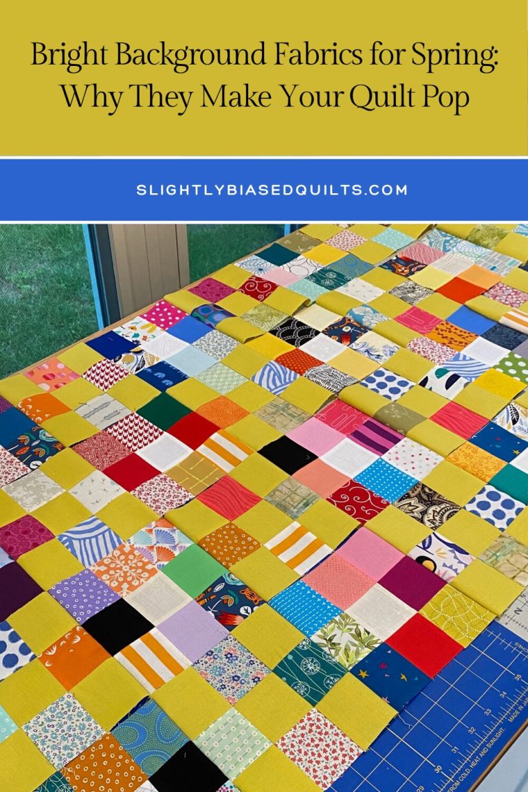
The background is like the stage for your quilt’s story. It gives your blocks a place to breathe, enhances color contrast, and can even set the mood for the entire piece. A bright background in particular can make your colors feel fresh and lively, especially after months of darker winter palettes.
Think of it this way: even a vibrant floral or geometric block can feel muted on a dull background, but place it against a crisp, light, or cheerful backdrop, and suddenly it pops. Your eyes are drawn to the blocks, the pattern comes alive, and the quilt has energy that feels seasonal and joyful.
Choosing the Right Brights
When selecting a bright background, consider:
- Tone vs. color: Soft creams, warm whites, or light pastels often complement bolder prints without overwhelming them.
- Print scale: Small-scale prints or subtle textures work beautifully as backgrounds—they provide interest without stealing attention.
- Mood: Decide if you want a crisp, clean feel (white or cream) or a cheerful, springtime vibe (soft yellow, mint, or light coral).
-
Bold vs. Subtle: Don’t be afraid to go really bold with a hot pink or chartreuse. It might be exactly what your pattern needs! On the other hand, a subtle background is a wonderful choice if your blocks already have lots of prints and texture.
Sampling fabrics behind a few blocks or even mock-ups can help you see which background makes your quilt truly shine.
Using Bright Backgrounds to Create Contrast
Bright backgrounds are especially effective when:
- Your blocks are colorful or high-contrast, making each motif stand out.
- You want a modern, airy look, even with traditional block patterns.
- You’re working with scrappy or multi-colored quilts, as a consistent light backdrop unifies the design.
Contrast isn’t just visual—it affects how the quilt “feels” on the bed, wall, or couch. A bright background makes your design look intentional, cheerful, and polished.
Tips for Working With Bright Backgrounds
- Prewash fabrics to keep your whites and pastels crisp.
- Consider quilt top placement—rotate blocks to maximize how colors “pop” against the background.
- Don’t be afraid to mix subtle prints with solids; even a faint texture adds depth without stealing attention.
- Balance is key: bright backgrounds shine when paired with blocks that have enough contrast in tone or color.
Let Your Quilt Shine This Spring
Bright backgrounds aren’t just a trend—they’re a way to give your quilt personality, energy, and a little seasonal joy. With careful selection and a mindful eye for contrast, you can turn a simple block arrangement into a quilt that radiates freshness and vibrancy.
So this spring, when you’re ready to start a new project, don’t forget the magic behind the blocks. Choose a background that lets your quilt pop—and watch your colors come to life in a way that feels playful, light, and absolutely spring-ready.