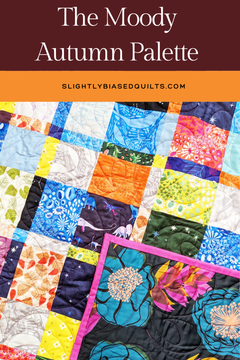
As the season begins to shift, there is nothing quite like settling in with a fresh cup of tea and a new design plan. When we think of autumn quilting, our minds almost automatically jump to the novelty prints: bright pumpkin oranges, goldenrod yellows, and turkey browns. While those classic hues hold a nostalgic charm, designing a sophisticated, moody fall quilt means pushing past the predictable and reaching for richer, unexpected colorways.
If you want an autumn quilt that feels less like a Halloween decoration and more like a high-end heirloom, it is time to rethink your palette
Anchor with Midnight Navy
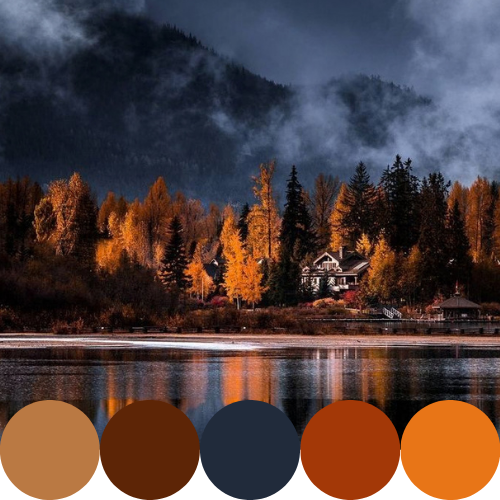
Anchor with Midnight Navy Instead of relying on black or dark brown for high contrast, try using a deep midnight navy. It brings the same grounding weight to a quilt pattern but feels infinitely more elegant. Navy acts as a gorgeous, atmospheric backdrop that makes warmer tones pop, mimicking the feel of early autumn evenings when the sky turns a deep, inky blue before the stars come out.
Bordeaux and Copper Over Red and Orange
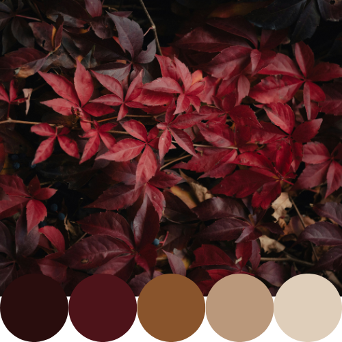
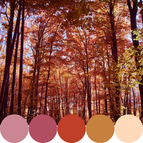
Bordeaux and Copper Over Red and Orange Swap out the fire-engine reds and primary oranges for their moodier cousins. A rich bordeaux wine red adds immediate luxury and depth, evoking the color of fallen oak leaves and late-season berries. Pair this with copper—a slightly muted, metallic-leaning shade of orange—to bring warmth and a subtle, earthy glow to the overall design. When bordeaux and copper sit next to each other, they create a glowing, autumnal warmth without screaming “fall theme.”
Dusty Rose as the Unexpected Neutral
Dusty Rose as the Unexpected Neutral Every quilt needs a lighter resting space for the eye, but stark white can be too harsh for a moody palette. Dusty rose is the perfect bridge. It softens the intense contrast between the midnight navy and the bordeaux, pulling the whole colorway together. It is an unexpected choice for fall, yet it feels entirely organic, reminiscent of dried florals and fading late-summer gardens.
Planning the Palette
When working with these nuanced, deeply saturated tones, I highly recommend auditioning your fabrics before making the first cut. Pinning physical swatches to a corkboard or dropping digital fabric chips into a Canva mood board is incredibly helpful. It allows you to see if the midnight navy is overpowering the dusty rose, or if you need a touch more copper to balance the bordeaux.
This season, challenge yourself to skip the novelty leaves and pumpkins. By leaning into these rich, moody hues, you will create a stunning autumn quilt that transitions beautifully through the entire winter season.